Comeup E-commerce Project
Comeup is an activewear brand that brings together designs with functional fabrics and aesthetic designs with sports enthusiasts to bring a new breath to the adventurous and energetic city life.
Project Summary
The client required a responsive, minimalist website that reflected the brand's premium quality and offered an effortless shopping experience.
As the sole designer, I managed the entire product lifecycle, consulting with the client to define requirements and deliver a tailored solution.
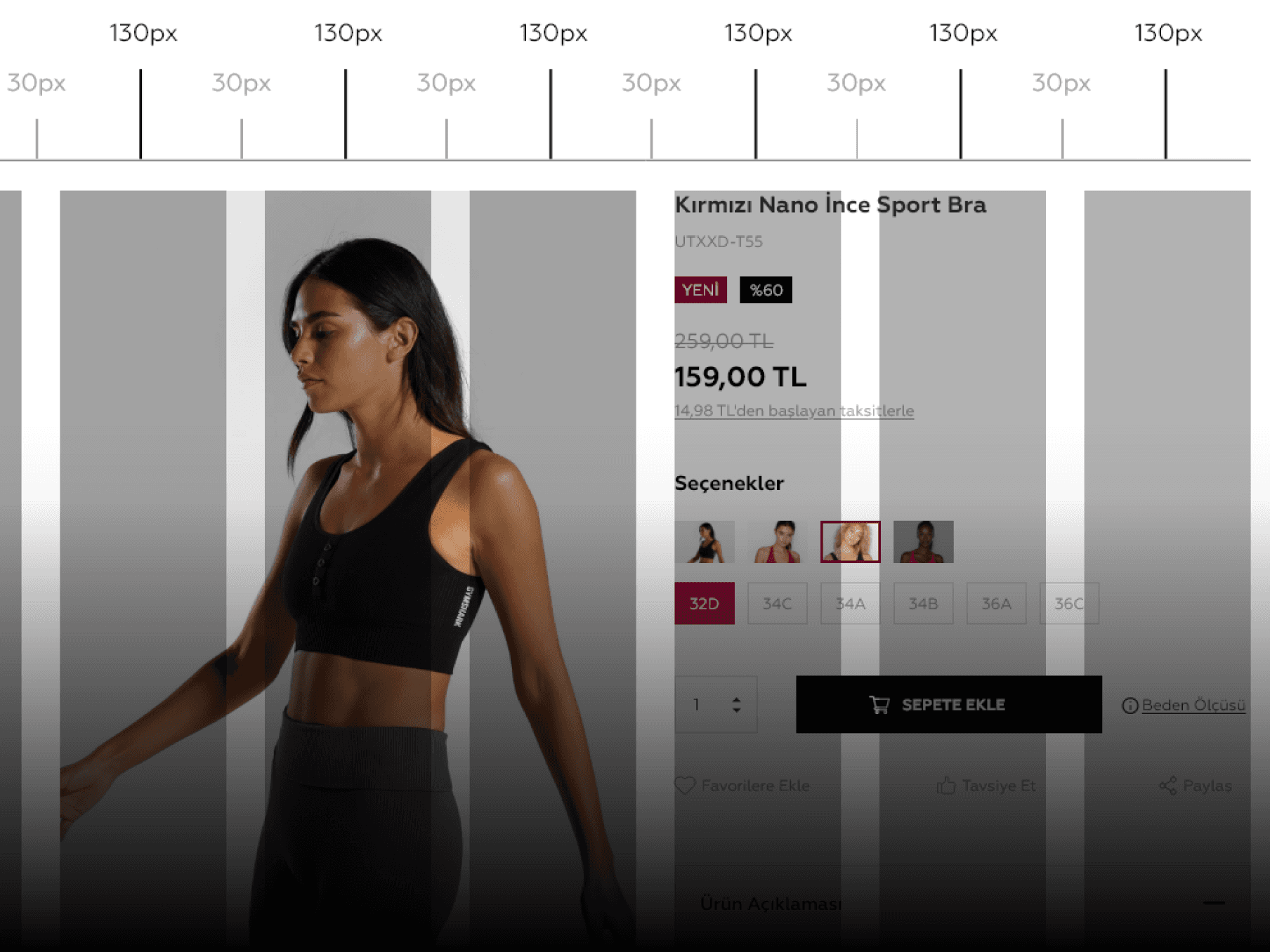
Grid
The website design had a fluid grid layout to ensure that the website is responsive and adapts to different screen sizes. The gutter size was set to 30px to create a visually pleasing space between the different elements, and the column width was set to 130px to create a balanced look. The container size was set to 1920px to provide a large canvas to showcase the product images in a prominent way.
Colors
Black and white were chosen as the predominant colors for a simple and clean look, following the minimalist and basic design concept for the project.

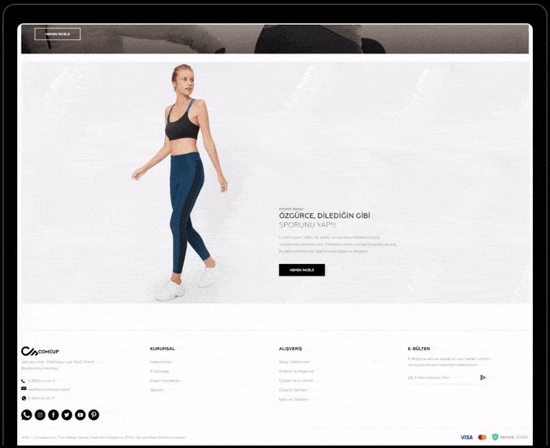
Home Page
I used high-quality images and short, clear text to showcase the products, and made sure to highlight the premium quality of the materials used. I also aimed to keep the layout uncluttered and visually appealing, using a clean and simple design aesthetic. This approach helped to convey the brand's message and values to visitors.
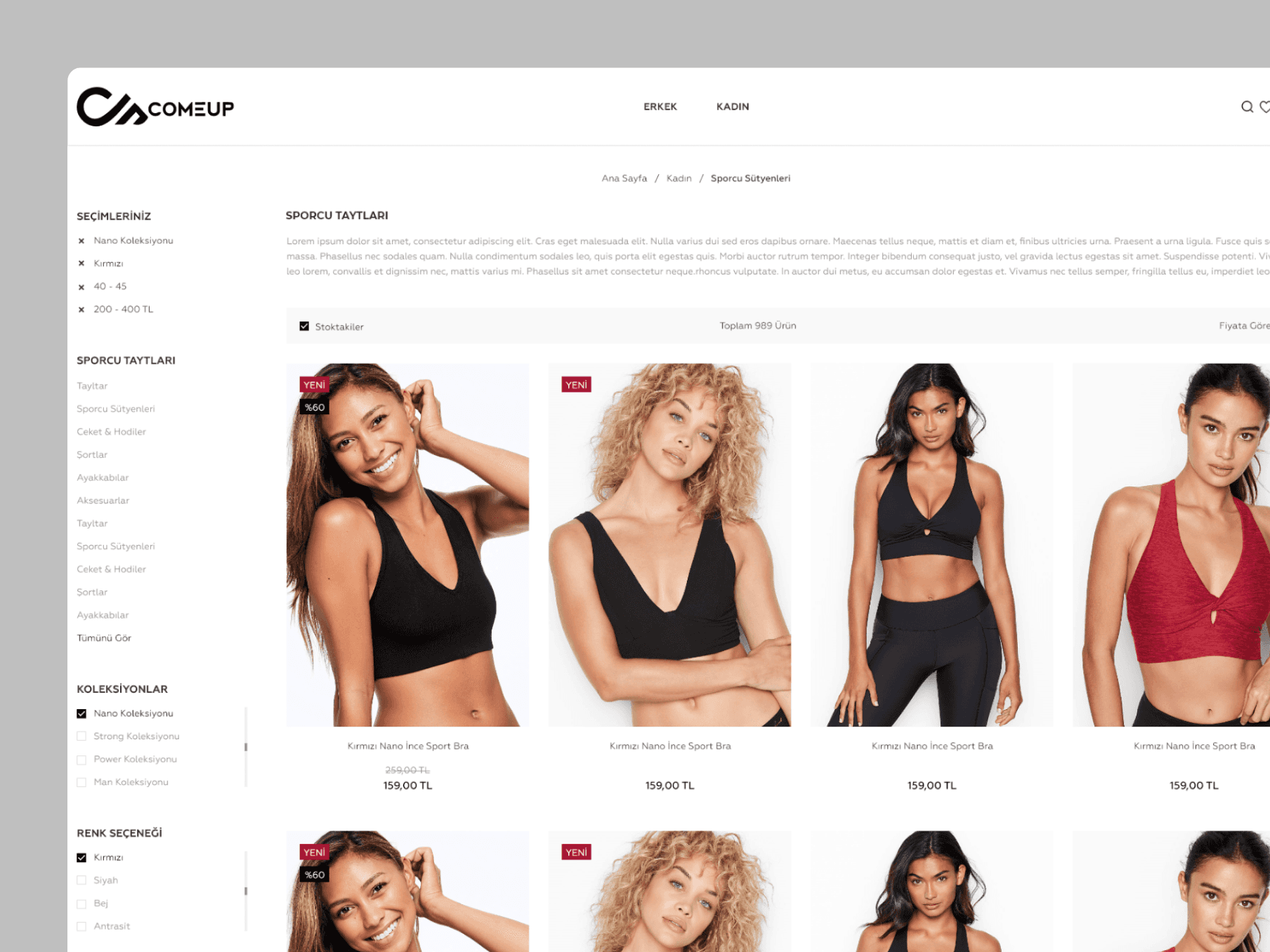
Category Page
The website features a clear navigation menu and filters to help users find exactly what they're looking for quickly and easily. The categories and filters are intuitively labeled and organized to provide a seamless browsing experience.
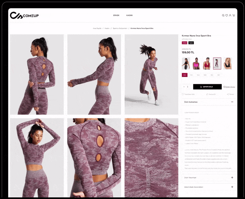
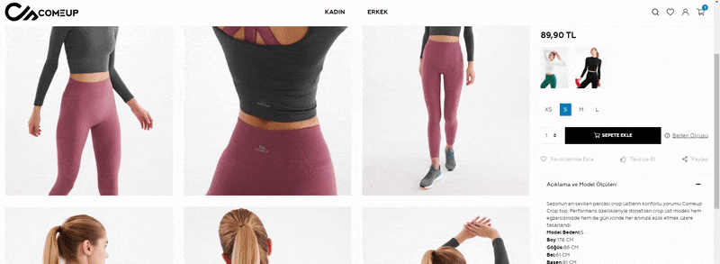
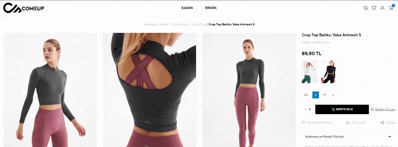
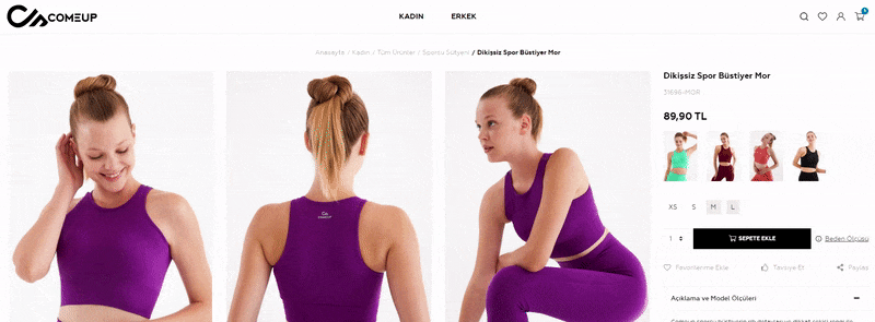
Product Page
I made sure to include clear and high-quality product images, so users can get a good understanding of what they are buying. The layout of the product page was designed to highlight the premium quality of the product and its materials. The page also included options for users to select different sizes and colors, as well as any available customization options.
Mobile Pages
To ensure a smooth mobile experience, I prioritized a mobile-first approach, ensuring a flawless experience across all devices and resolutions. Given that 60% of e-commerce traffic in Turkey originates from mobile devices, optimizing the mobile layout was critical for the project's success.

Results
Responsive Design
Mobile, web and desktop support. Mobile optimization was a key consideration in the design process, making sure that the website provides a seamless experience for users on all devices.
Detailed Product Display
Enhanced product pages with comprehensive material details and integrated user reviews to build trust and highlight craftsmanship, directly addressing user need for transparency.
General Overview
Overall, it was a challenging yet fulfilling project. I faced several obstacles but was able to find solutions and deliver a responsive, simple and minimalist website that effectively showcases the premium quality of the products made with high-quality materials.