Login/Signup Project Case Study
Modanisa enables modest women to look good and feel self-confident in today's world. Modanisa's mission is to build a global ecosystem that combines fashion and technology to serve the lifestyle needs of modest women.
Summary
I led the end-to-end redesign of Modanisa’s login and sign-up flows for iOS and Android over a one-year period. As the sole UX Designer, I managed the entire process from initial research and design to testing and launch, ensuring a seamless experience across mobile apps and mobile web.
Goals
Why was such a project needed?
Issues with user experience in the login and registration flows, along with insufficient alternative login/signup options.
What was the aim of the project?
To enhance the user experience by leveraging data-driven insights while respecting existing user habits. Key objectives included introducing passwordless login, improving security, and reducing drop-off rates.
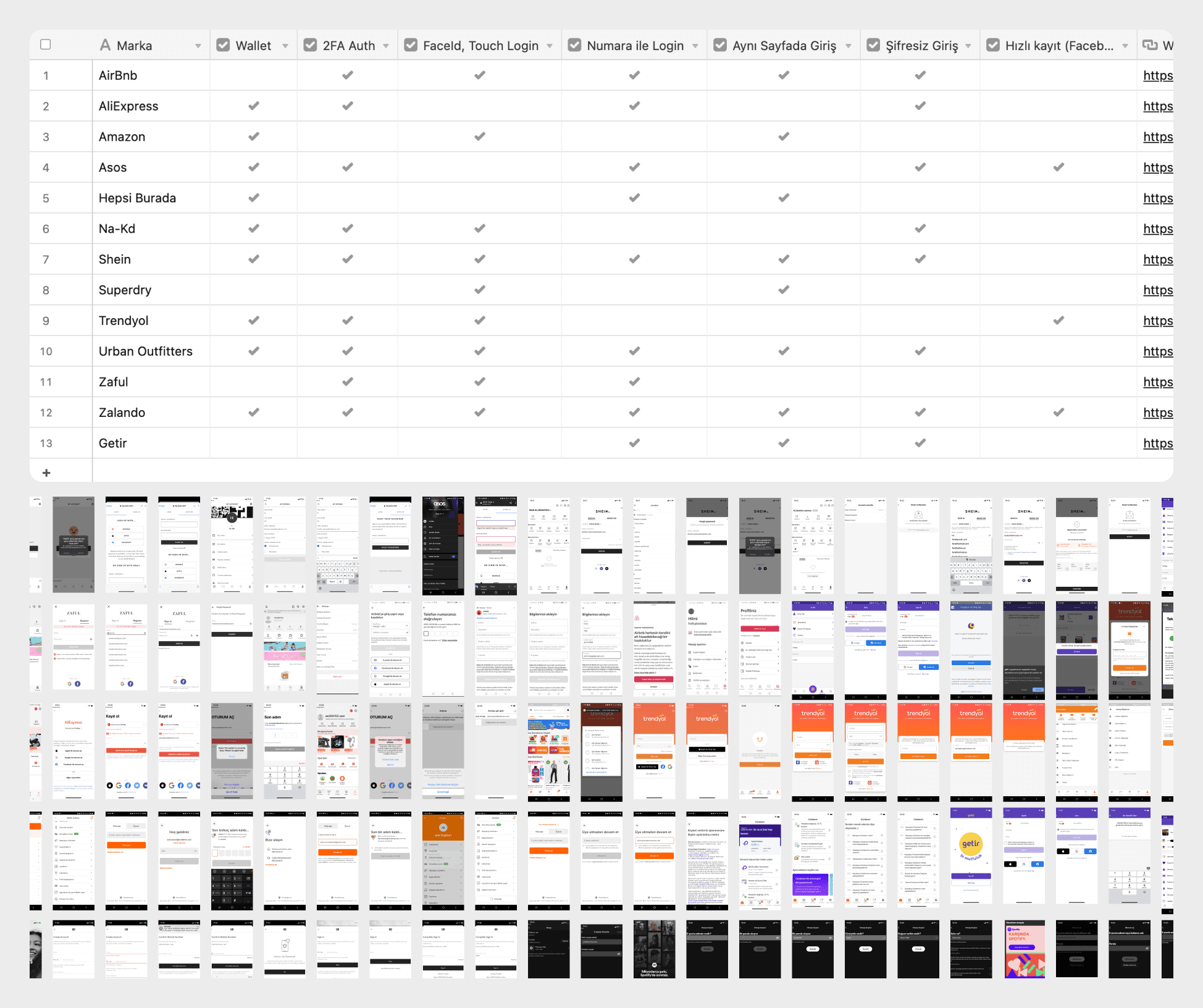
Competitor Analysis & Benchmark
At the beginning of the project, I placed great importance on the analysis process to create the right design for our users. I applied various analysis techniques, which I have detailed separately below.
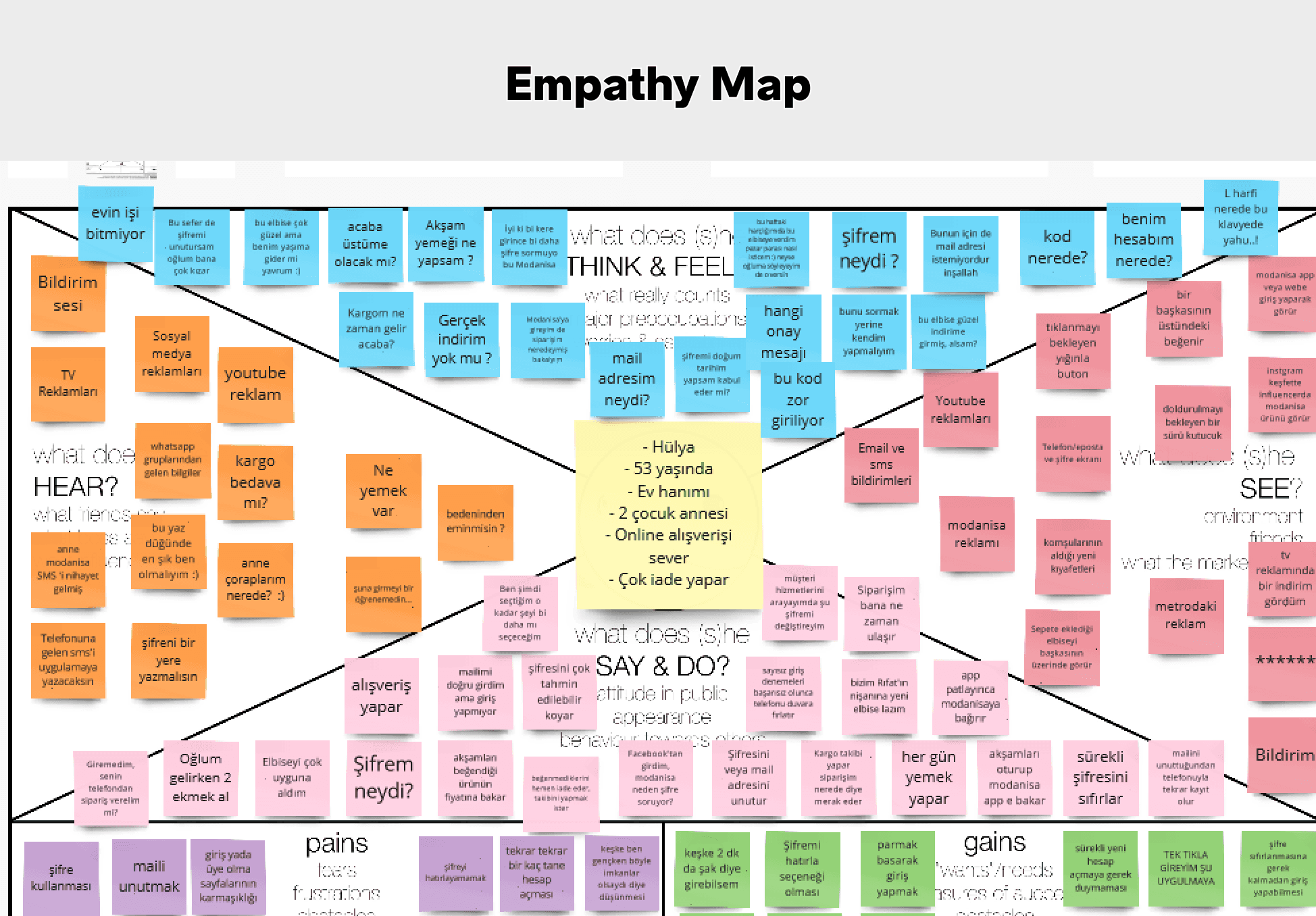
Empathy Map
To accurately understand our target audience, we first created personas. After developing our personas, we applied a technique that helped us empathize with them. The most crucial aspect of this technique was putting ourselves in the user's shoes, allowing us to better identify and address their needs.
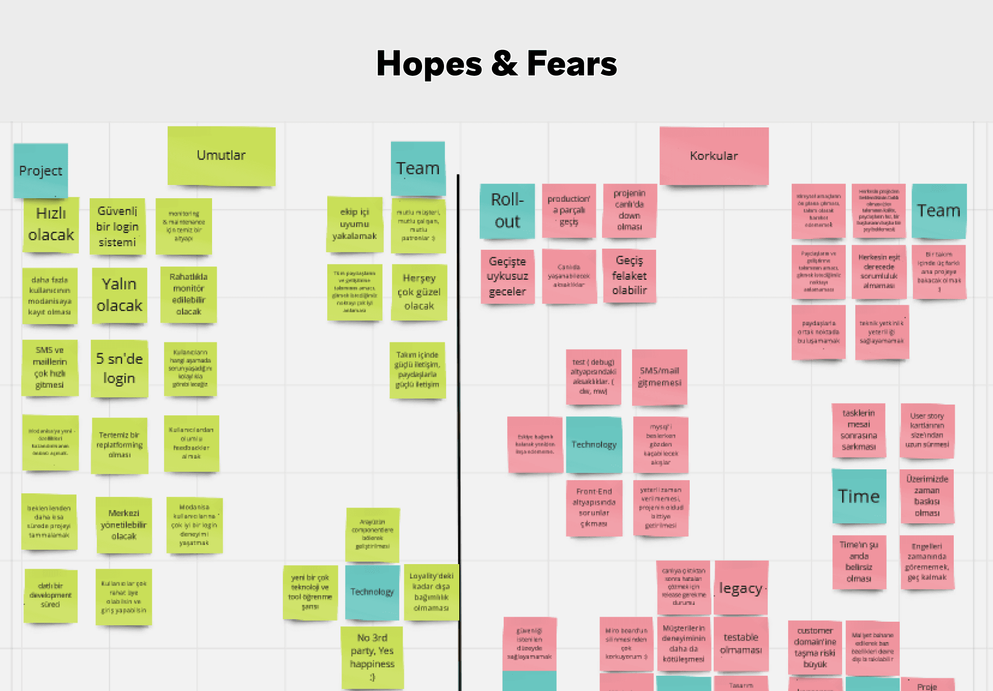
Hopes & Fears
After understanding the user, we applied this technique within the team at the start of the project to foresee what could go right or wrong. By anticipating potential problems and positive outcomes, we were able to create appropriate scenarios, thus preventing cost and time losses.
Wireframe
Visually, I began the initial work at this stage. After the analysis and research phases, I took the first steps in developing the product and created various wireframes. The importance of these wireframes lies in their ability to help us identify and address any errors or improvements before the product progressed further.
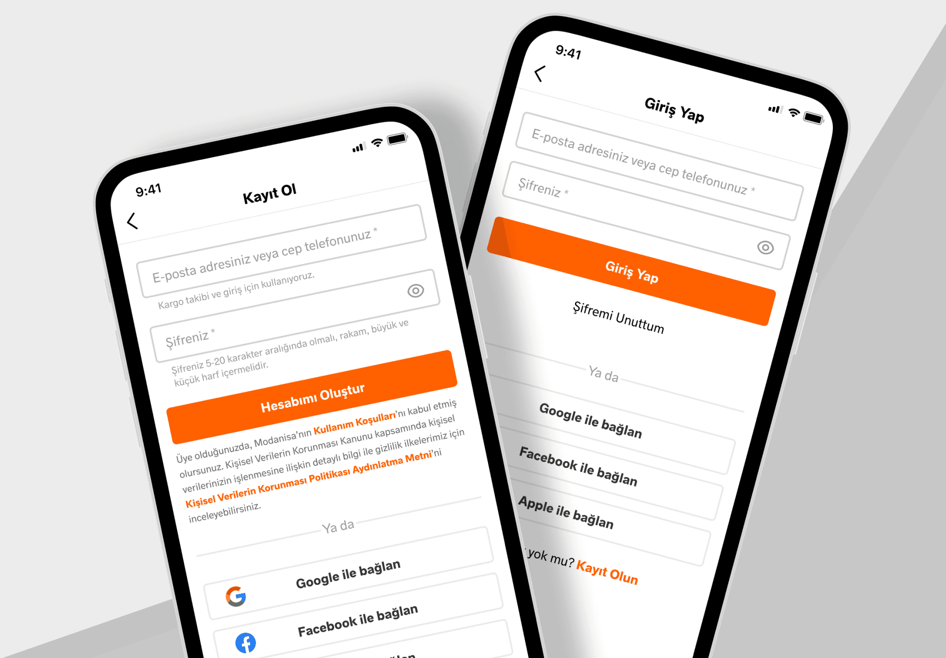
Login/Sign-up Data
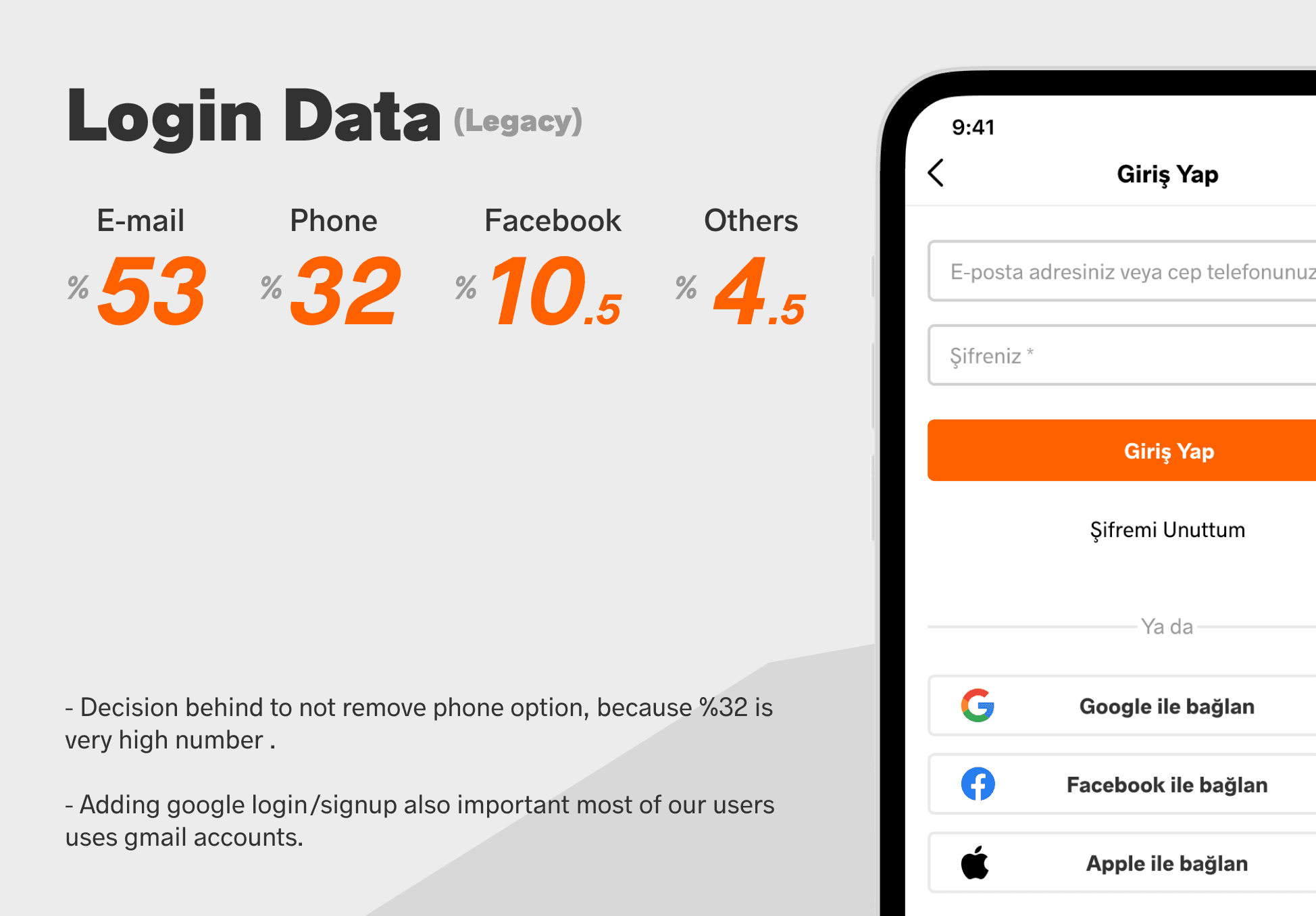
Login/Sign-up is a crucial point in the user's shopping experience, especially in scenarios where registration or login is mandatory. Based on this, we aimed to keep it simple without drastically altering user habits. Users could log in with either an email or phone number. Initially, we considered removing the phone option. However, upon reviewing the login data, we observed that a significant majority still preferred to log in using their phone.
Some of Our Design Decisions
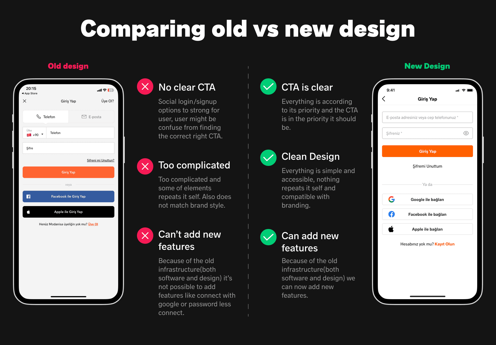
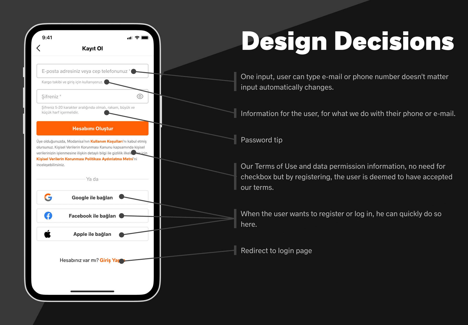
A key innovation was implementing a smart, unified input field that detects and formats either an email or phone number in real-time, simplifying the interface and reducing cognitive load. Dynamic input masking ensures clarity and prevents user errors.
Another issue was the lack of priority in the design, which sometimes confused users. The primary design decision was to make the login/sign-up button prominent as the main CTA. Other login methods were designed to be noticeable but without being the primary CTA.
Alternative Designs
In the later stages of the project, I developed alternative designs. However, we discarded all of them due to various reasons such as cost, insufficient infrastructure, performance issues, etc. The primary focus was to keep the design very simple and concentrated solely on the login/registration section.

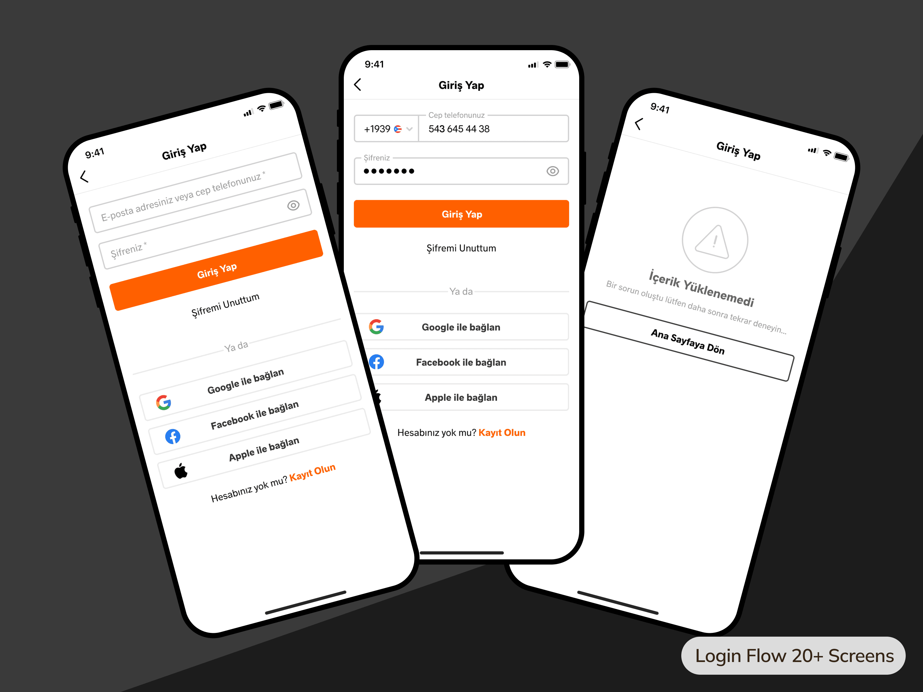
Login Flow
The login flow also involved more than 15 screens in all scenarios. This included error screens and success scenarios the user might encounter. The project was designed exclusively for mobile, with no desktop version available.
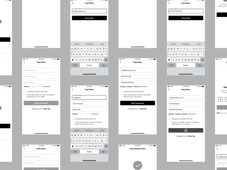
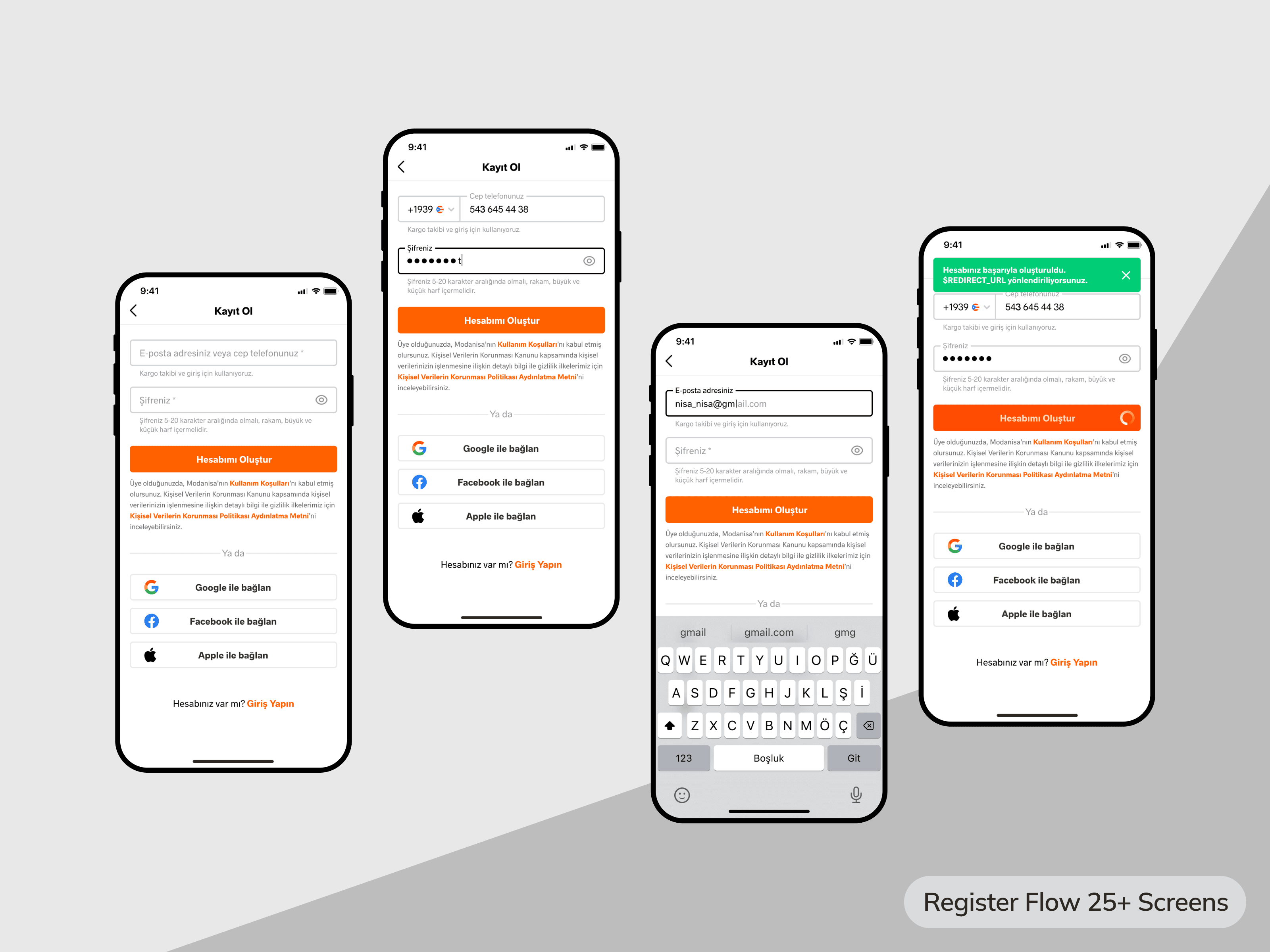
Sign-up Flow
The registration flow encompassed over 20 screens in all scenarios. This included error screens and success scenarios the user might encounter. The project was designed exclusively for mobile, with no desktop version available.
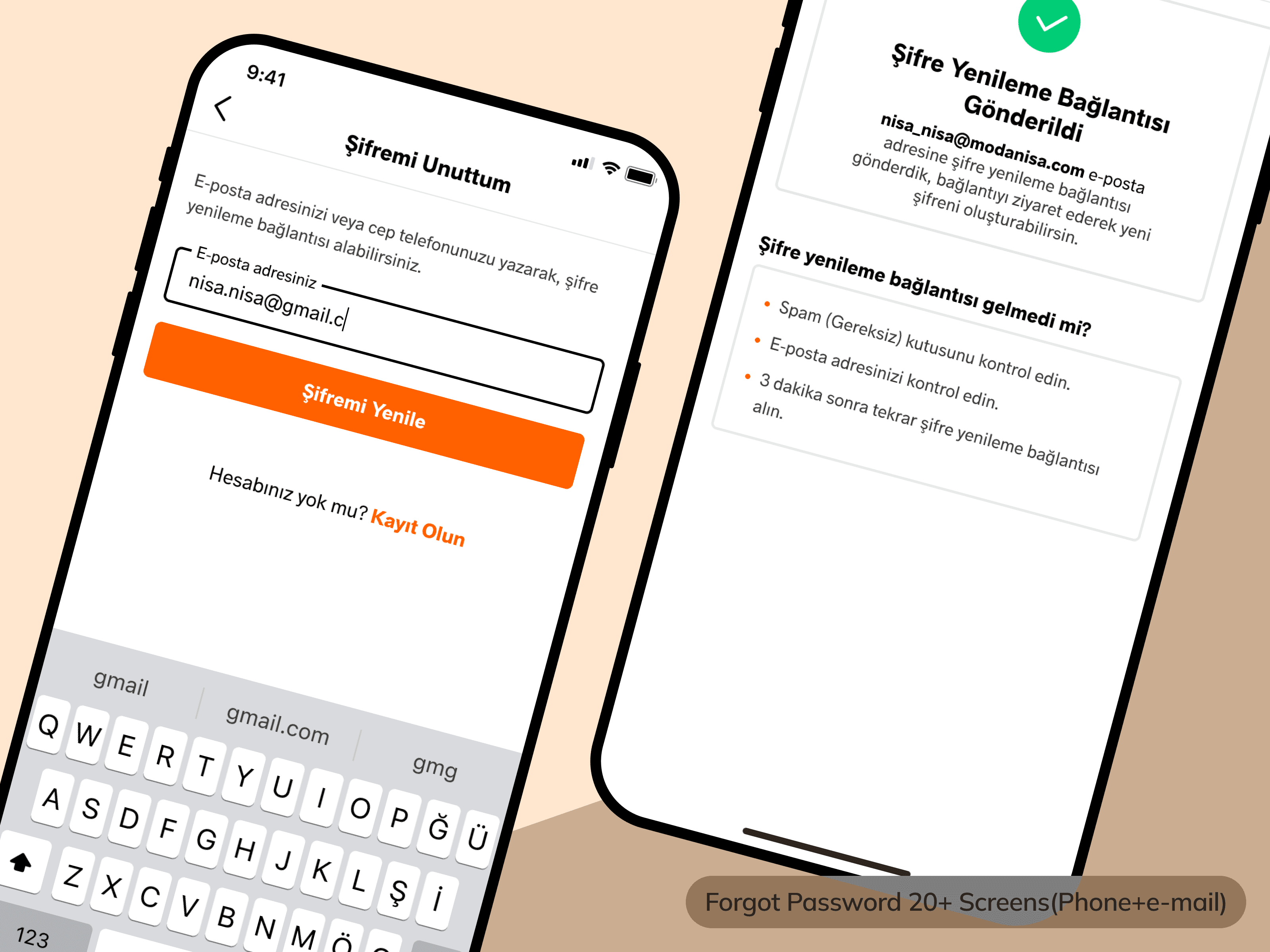
Forgot Password
When users forget their password, they can retrieve it via mobile phone or email. Previously, there were significant security vulnerabilities and server costs. However, in the new flow, everything has been optimized.
Change Password
Users can change their password through a reset link sent to their email or mobile phone. This process is executed through a webview. The main reason for this is that users can access their email from a desktop.

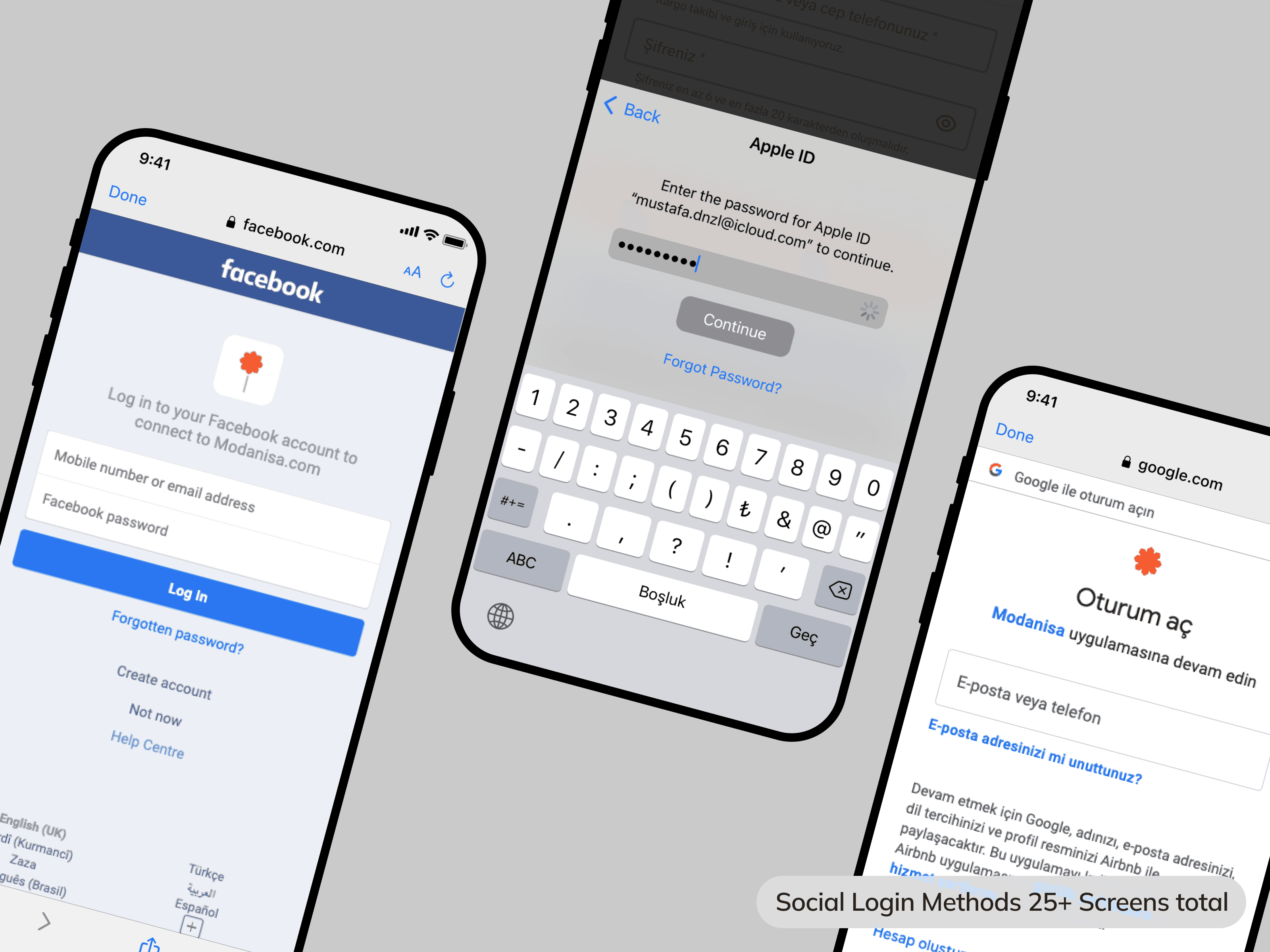
Social Media Login/Sign-up
Users can log in through three different social media alternatives. Whether they have an account or not, when they click one of the buttons, if they have an account, they log in; if not, they sign-up and log in. If a user previously signed up via email with a Gmail account and selects the option to connect with Gmail, the accounts merge.
Tools
Conclusion
The entire design process lasted 2-3 months. The time until the application was tested spanned a total of one year. It was developed for mobile iOS and Android. The first stage was considered an MVP. Infrastructure was established for the addition of many features in future stages. Testing began in over 140 countries.